MTS Bank · Mobile banking
Redesigning the MTS Bank home screen
I redesigned the app’s key screen around everyday financial tasks, making products easier to scan, common actions faster to reach, and the structure more flexible and personal.
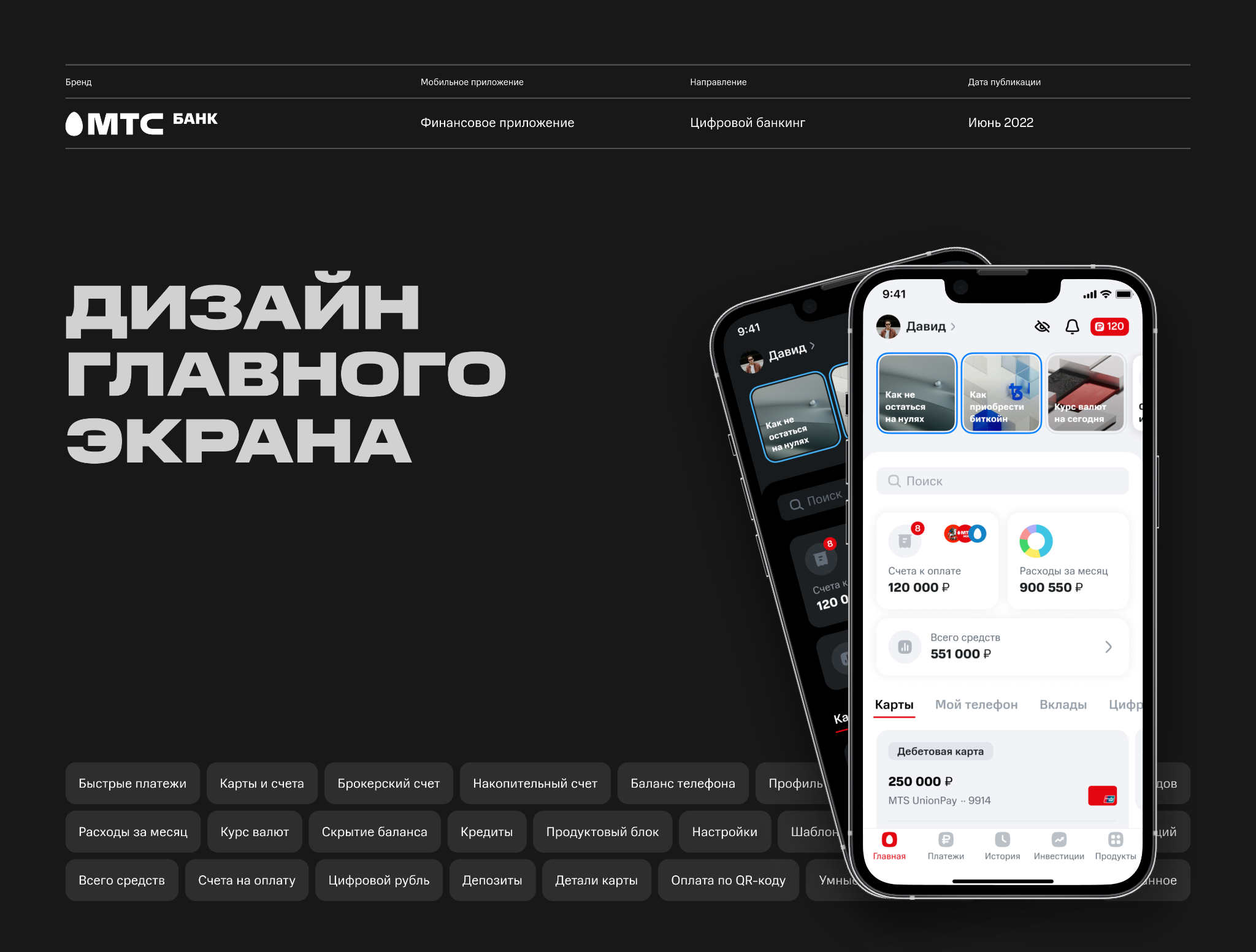
01 · Solution
A home screen built as a financial control center
Instead of a long product storefront, I proposed a modular structure where customers can understand their position at a glance, reach frequent actions quickly, and adapt the screen to the products they actually use.
What changed
Products, upcoming bills, spending, and total balance are brought into a clear hierarchy while secondary offers move out of the main task flow.
Design principle
The screen should adapt to the customer: show relevant products, let them hide what they do not use, and keep core operations close at hand.
02 · Process
From business requirements to validation in a test environment
The work moved through iterative product, research, and technical stages. Decisions were validated with customers, business stakeholders, and engineers before the final handoff.
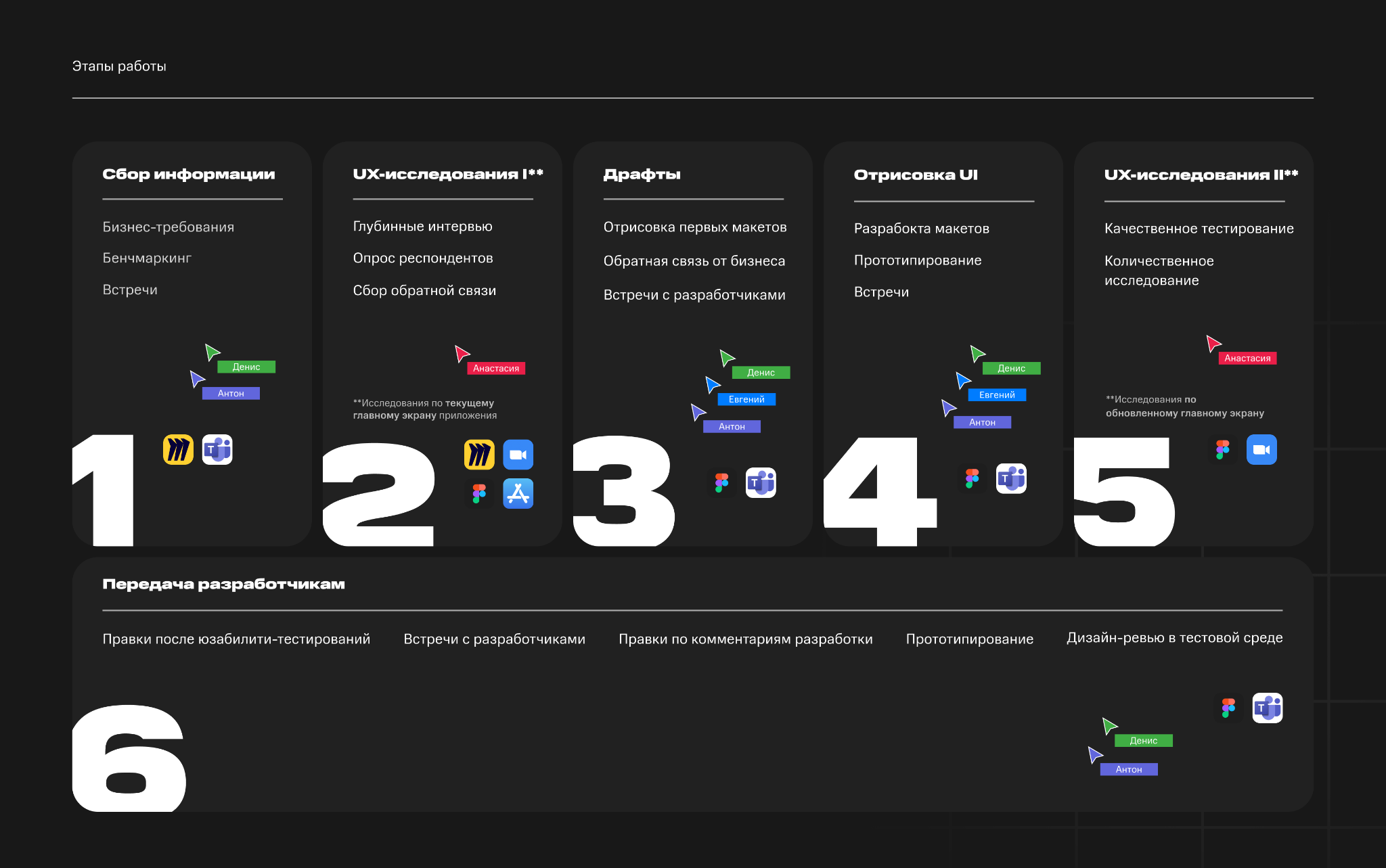
Requirements, two research cycles, drafts, UI, prototyping, and development handoff formed one continuous process with regular feedback.
03 · User problems
Customers wanted less noise and more control
Interviews and feedback revealed the same themes: the screen felt crowded, unused products got in the way, important actions were buried, and balance visibility behaved inconsistently.
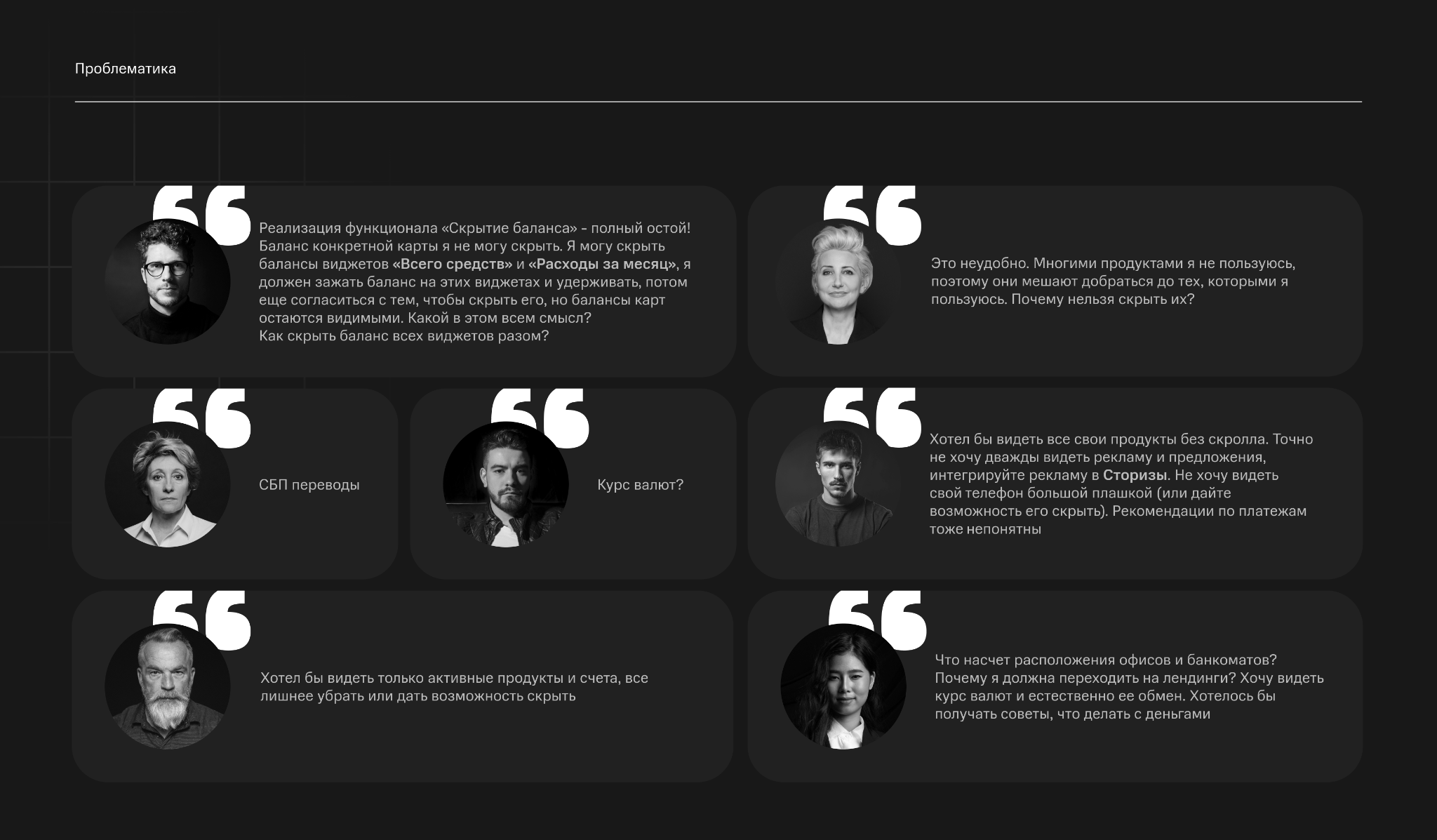
Personalization, clear balance privacy, quick payments, exchange rates, and a compact view of active products became the foundation of the new experience.
04 · Research
Testing more than usability: measuring emotional response
Together with UX analysts from Sense Machine, we compared three home screen variants. The study showed which product layout created a positive response without making everyday tasks harder to complete.
300
research participants
3
home screen prototypes
50 / 50
MTS Bank customers and non-customers
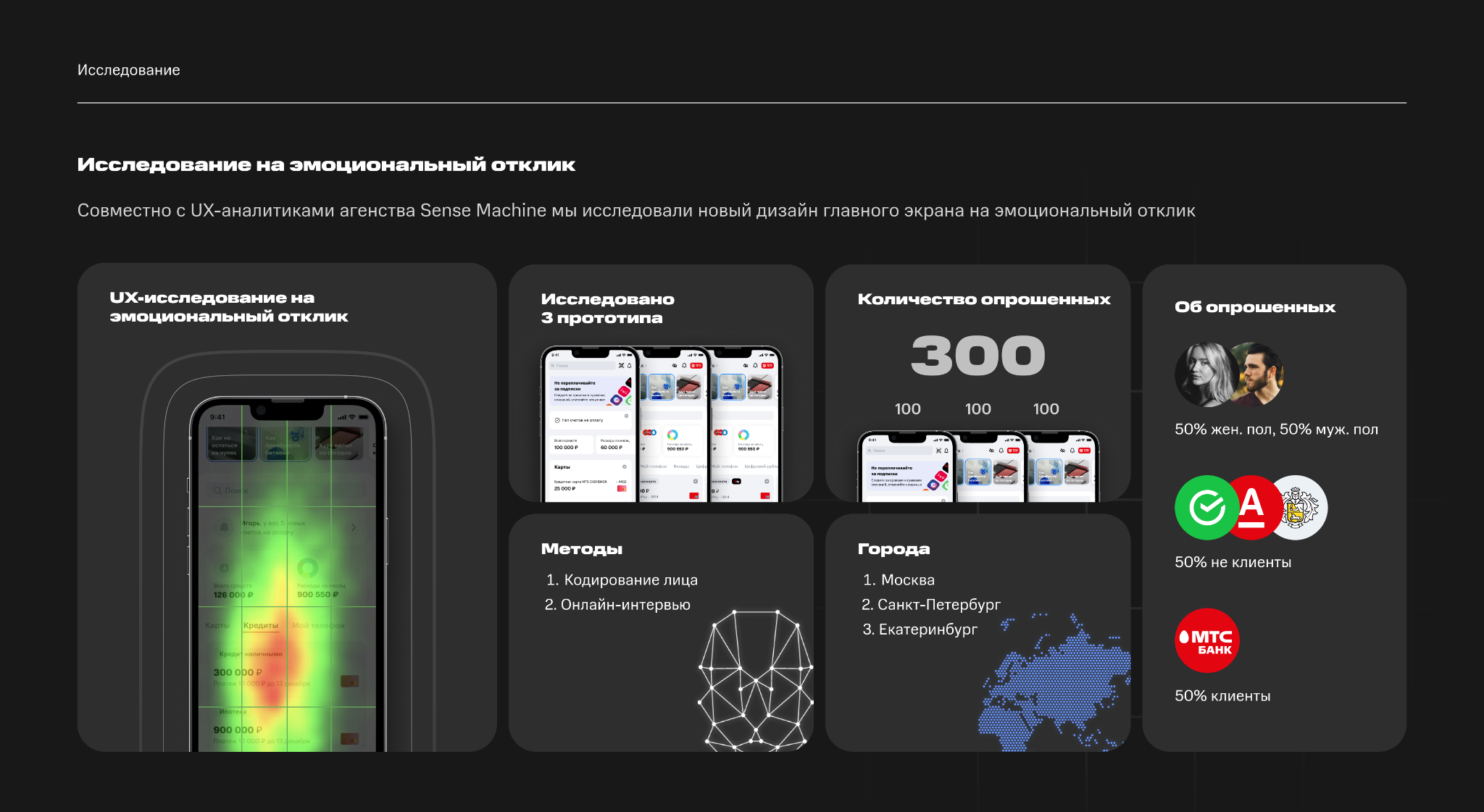
The sample covered Moscow, Saint Petersburg, and Yekaterinburg. We combined online interviews with facial coding and balanced the group by gender and existing relationship with the bank.
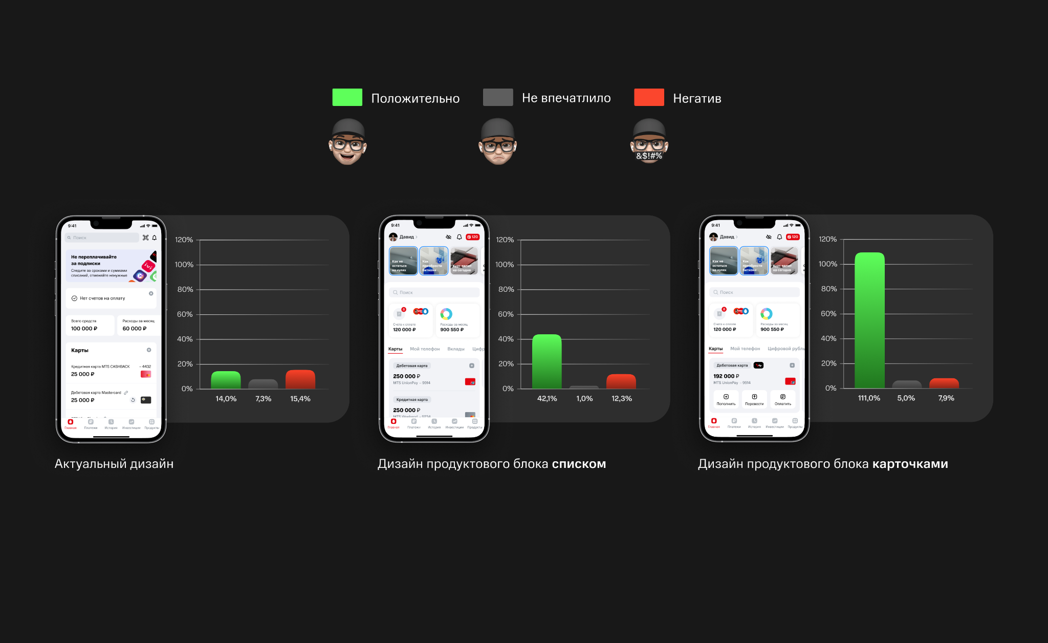
Cards produced the strongest immediate positive response, while the list also clearly outperformed the existing screen. Both new concepts removed the need for constant vertical scrolling between products.
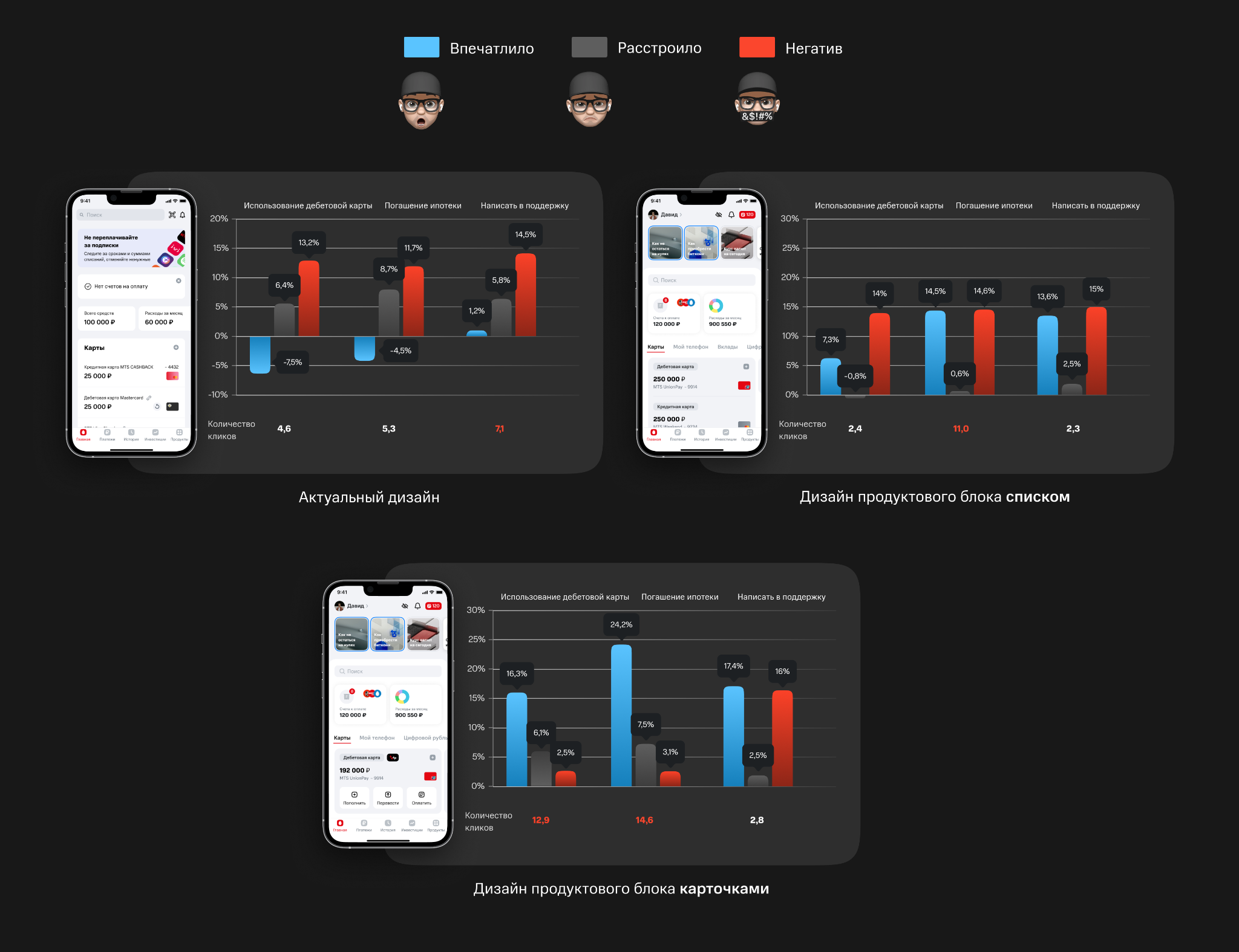
Cards felt more novel, but required more actions and a longer learning period. The list offered the best balance of emotional response, clarity, and task effort, so it became the direction for further development.
05 · Structure
A modular architecture instead of a linear feed
I broke the home screen into independent modules tied to specific customer tasks. This simplified navigation and created a foundation for personalization without rebuilding the entire interface.
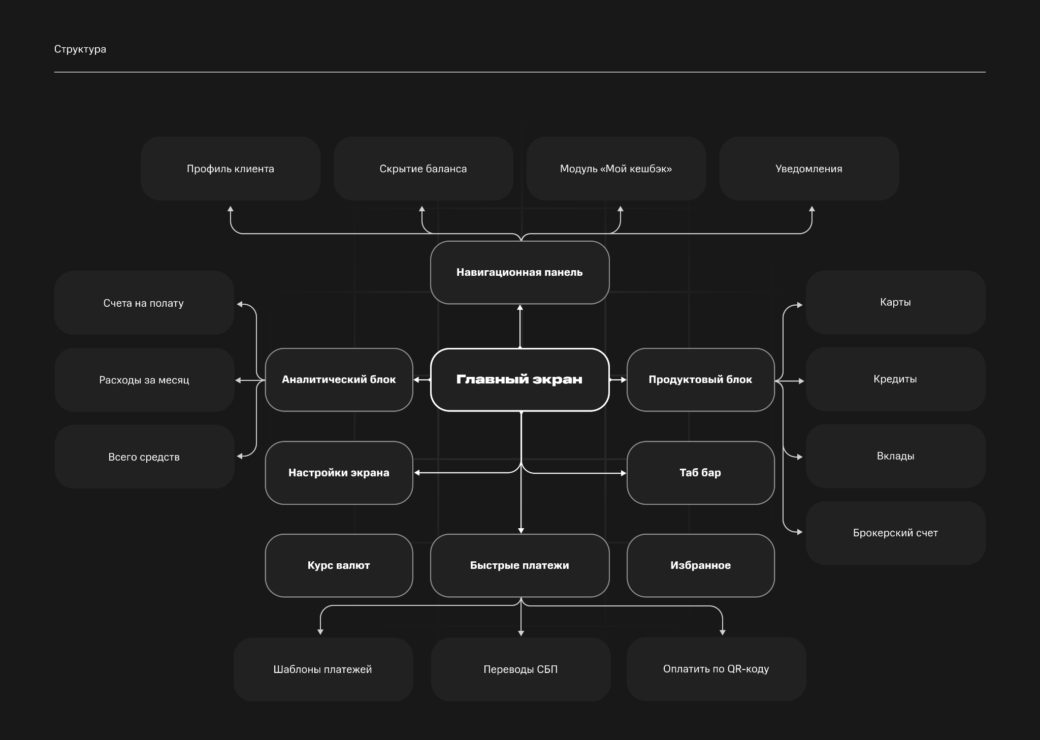
Navigation, insights, products, settings, quick payments, and favorites work as distinct modules with clear connections.
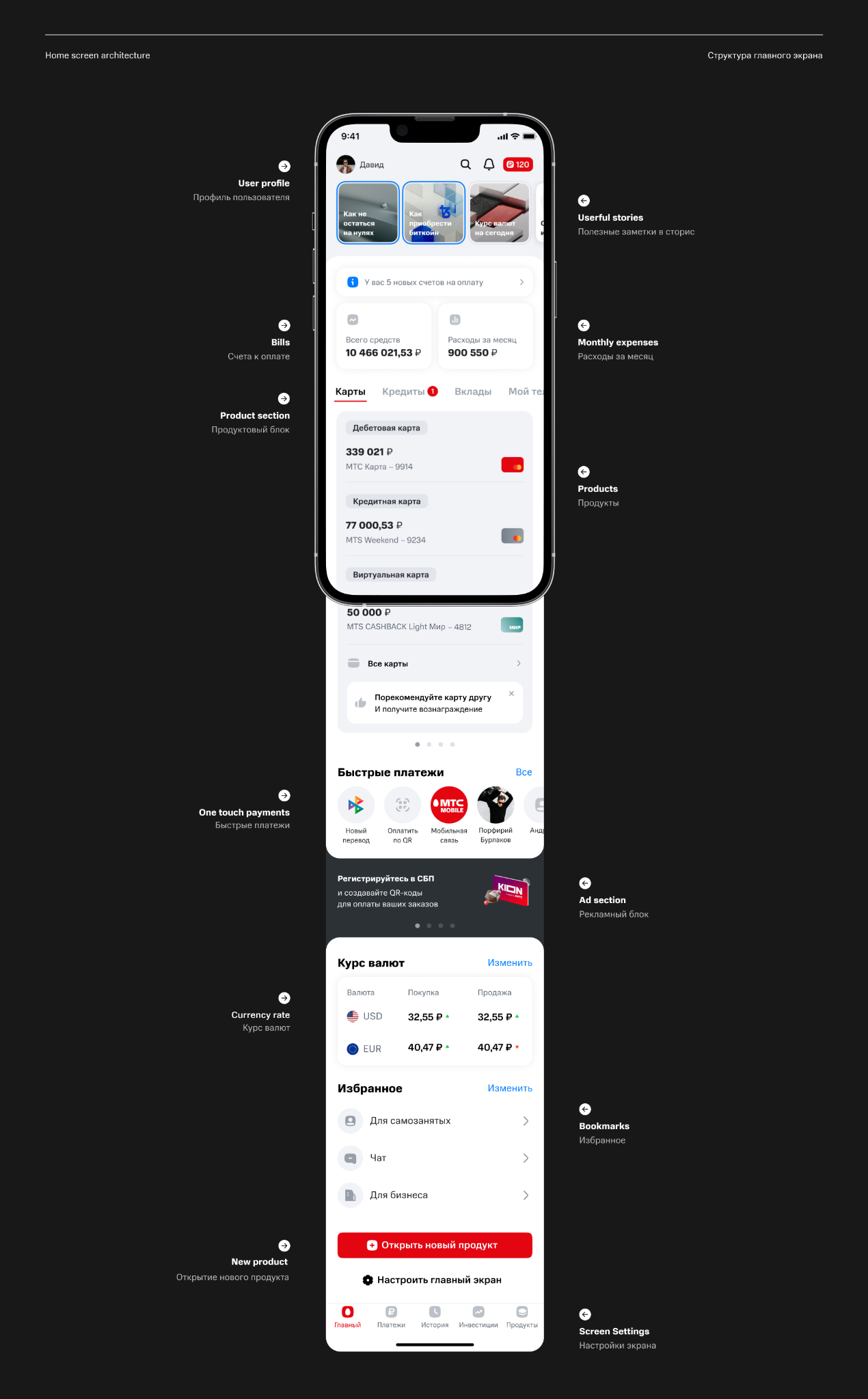
The screen moves from personal context and financial overview to products and quick actions. Ads, exchange rates, bookmarks, and new-product entry points remain available lower down without competing with core tasks.
06 · Outcome
A coherent experience designed to evolve
The outcome was an aligned home screen concept with an interactive prototype and a structure that can scale to new products and customer scenarios.
Clear priorities
Balance, active products, and frequent actions sit in the first layer.
Customer control
Unused products can be hidden and the screen adapted to individual needs.
Built to scale
The modular system supports new features without complicating core navigation.